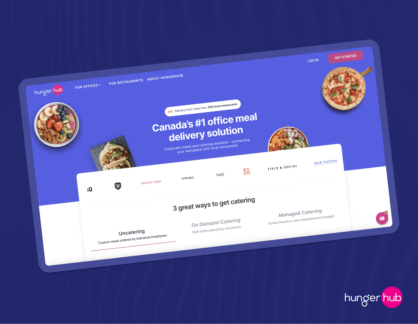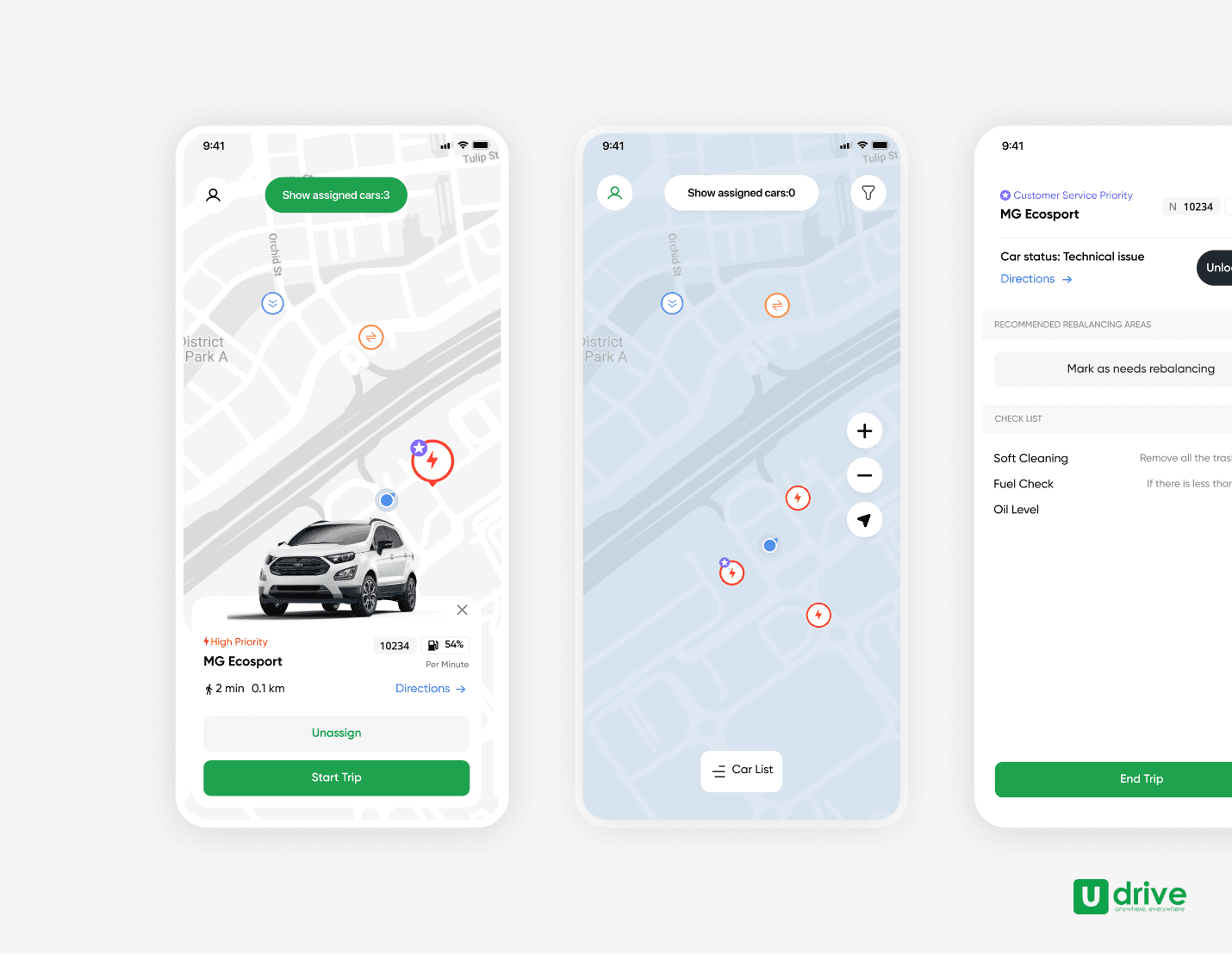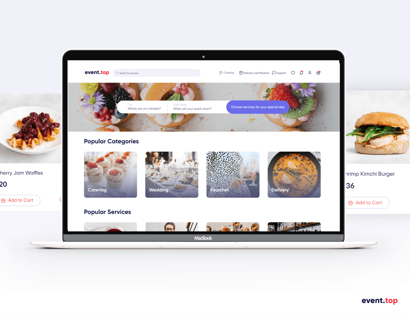
Catalog card redesign for a Grocery delivery app
Product card redesign for
a Grocery delivery app
Catalog card redesign for a Grocery delivery app
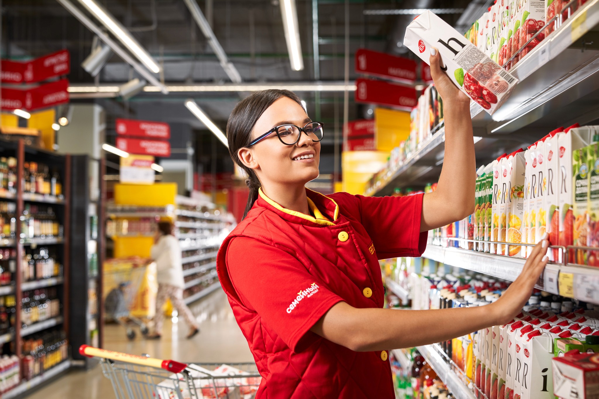
Designed a product card for a Magnet grocery delivery mobile app - one of the biggest grocery chains in Eurasia, an analog of Walmart. Was part of a Catalog product team and a design department consisting of 40 designers and UX researchers.
Designed a product card for a Magnet grocery delivery mobile app - one of the biggest grocery chains in Eurasia, an analog of Walmart. Was part of a Catalog product team and a design department consisting of 40 designers and UX researchers.
Designed a product card for a Magnet grocery delivery mobile app - one of the biggest grocery chains in Eurasia, an analog of Walmart. Was part of a Catalog product team and a design department consisting of 40 designers and UX researchers.
Challenges we faced
The main challenge was to work without a developer department which postponed live testing and the new design deployment . Company hiring difficulties resulted in a lack of developers, so product team was basically left without them.
But our team consisting of a product manager, analytics, designers, illustrators was determined to base our design decisions on the data we could gather from our current users and not spoil any metrics. We decided to conduct a research using the sources we have, which was quantitative and qualitative data.
Summary
Designed a product card for a Magnet delivery mobile app - of the biggest grocery chains in Russia, an analog of Walmart. Was part of the Catalog product team and the design department consisting of 40 designers and UX researchers.
Role
UI/UX Product designer
UX Researcher
Key skills
Mobile app design
Qualitative UX research
Design System
Mobile app design
Qualitative UX research
Design System
Team
Product manager
UI/UX designer
2 UX Researchers
Challenges we faced
The main challenge was to work without a developer department which postponed live testing and the new design deployment . Company hiring difficulties resulted in a lack of developers, so product team was basically left without them.
But our team consisting of a product manager, analytics, designers, illustrators was determined to base our design decisions on the data we could gather from our current users and not spoil any metrics. We decided to conduct a research using the sources we have, which was quantitative and qualitative data.
Problem to solve as a team
Magnet Delivery app was a part of the Magnet Grocery Stores product application system. Our product team was responsible for the catalog design. At the time, we were working on product card features, including weight info and 18+ product appearances.
Challenges we faced
The main challenge was to work without a developer department which postponed live testing and the new design deployment . Company hiring difficulties resulted in a lack of developers, so product team was basically left without them.
But our team consisting of a product manager, analytics, designers, illustrators was determined to base our design decisions on the data we could gather from our current users and not spoil any metrics. We decided to conduct a research using the sources we have, which was quantitative and qualitative data.
Design process
Gather information
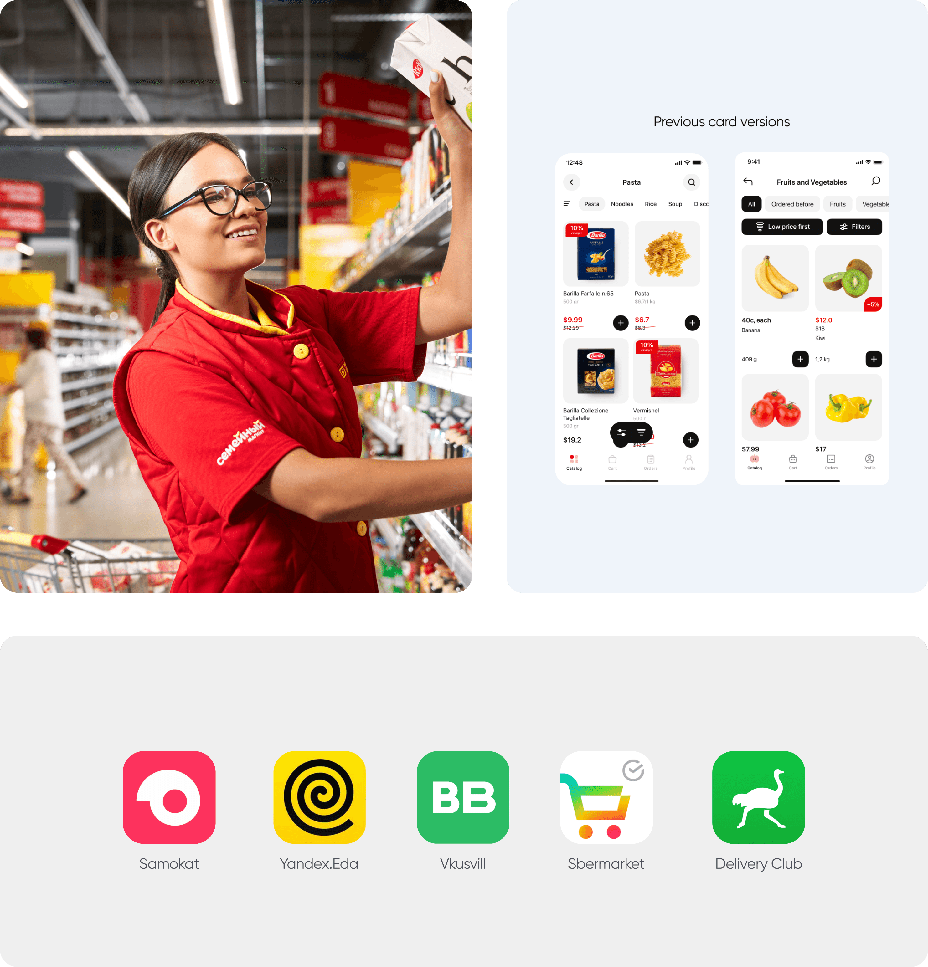
I started by gathering and comparing product card designs of our competitors. Our main competitors were Yandex Eats, Delivery Club, Sber Market. I also had meeting with other designers from my team to know more about the previous card design.
Step 2
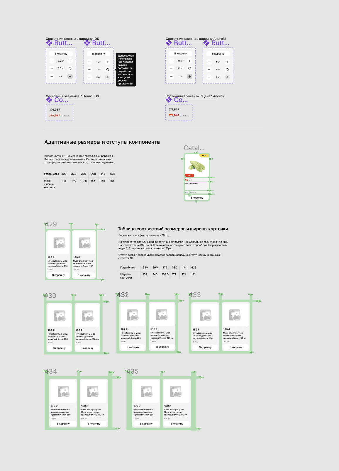
Prototypes in Figma
After creating card design, I prepared animated prototypes that imitated how the real app work. For that, I used Figma components.
UX Research
To test our new designs, I worked closely with UX research department, which resulted in picking the best design decision by carefully testing our current users. We used deep interviews and qualitative research to prove or refute hypotheses I highlighted.
Insights and rethinking
the design created
After the UX research was done, it was time to finalize the designs, make improvements based on the insights we gathered during our research and create documentation for developers based on Figma and Notion files. Also, a presentation was held to show improvements that were made to the product development department.
New feature tested
and ready for implementation
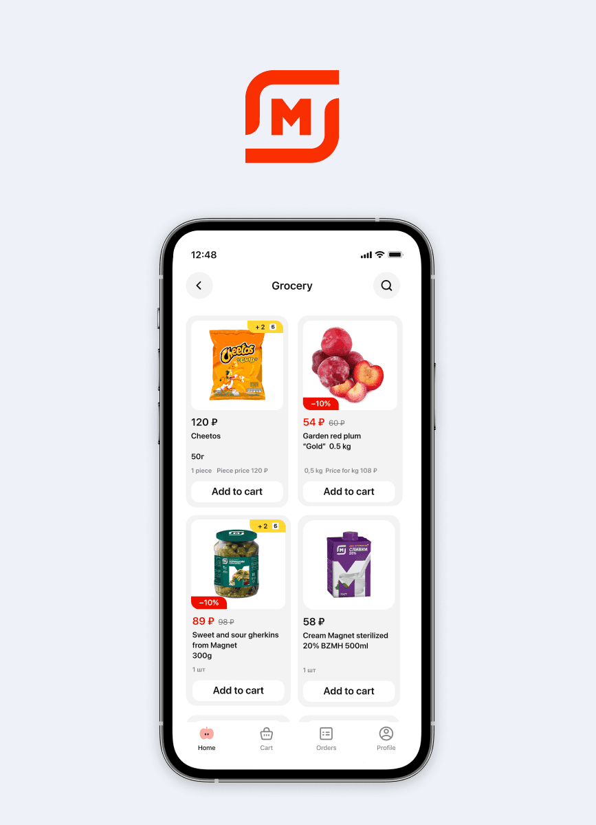
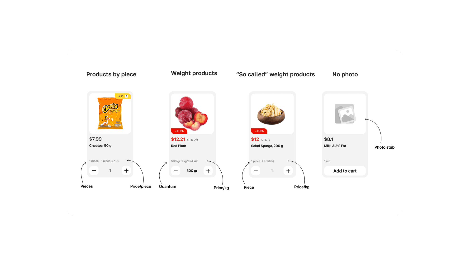
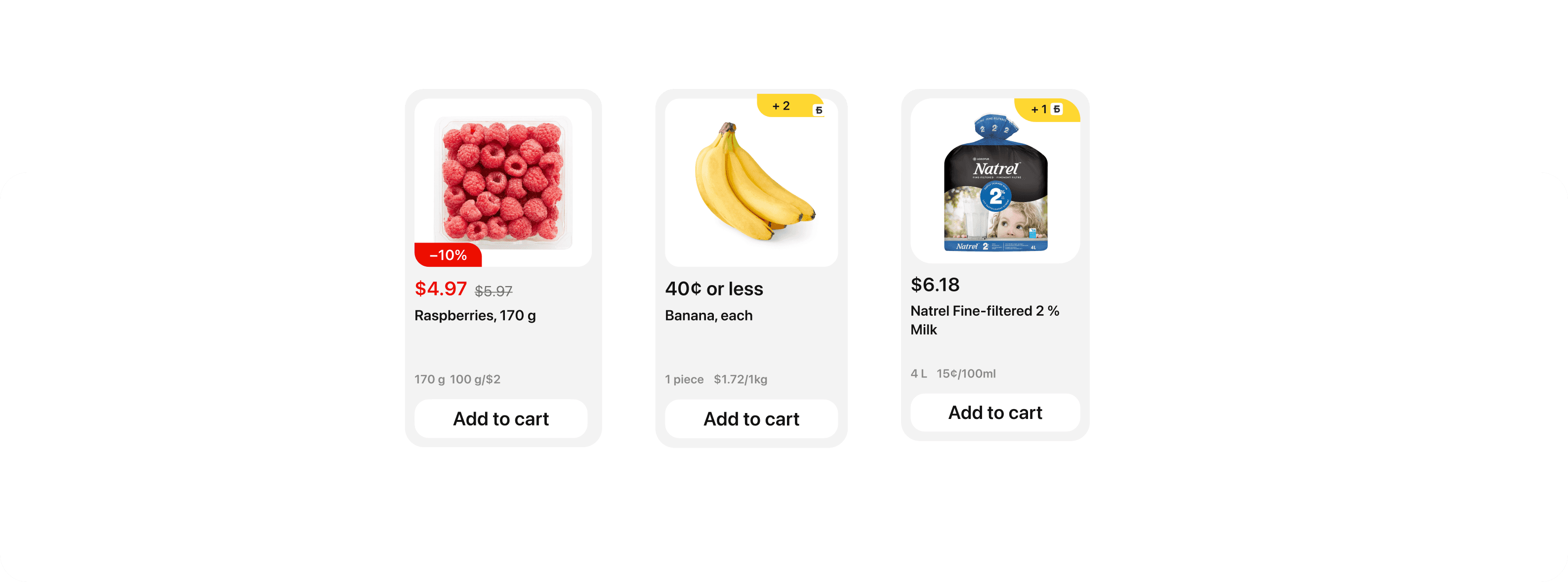
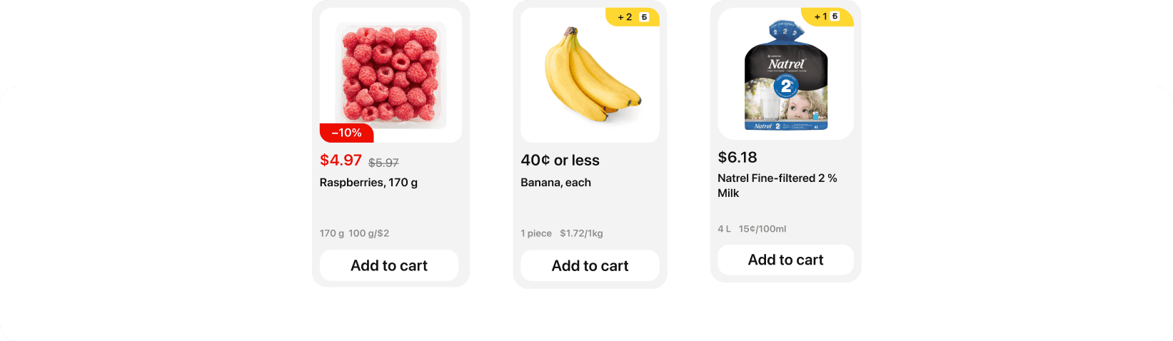
Now, in the Delivery (2.0) application, the price per quantum is displayed in the weight product cards (i.e., the amount of goods that can be added to the cart). We want to show the user an additional cost per kg, so that the user can compare prices and choose more favorable offers for himself. You need to draw layouts for displaying the price per kg for weight products in the catalog and product cards.
Challenges we faced
The main challenge was to work without a developer department which postponed live testing and the new design deployment. Company hiring difficulties resulted in a lack of developers, so the product team was left without them.
But our team consisting of a product manager, analytics, designers, and illustrators was determined to base our design decisions on the data we could gather from our current users and not spoil any metrics. We decided to conduct research using the sources we had, which were quantitative and qualitative data.
Why product card redesign
was necessary?
The old catalog design didn’t aligned with the industry standards. Some information was lacking, which stopped our users from making orders due to an inability to compare prices and choose the best option.
Why product card redesign
was necessary?
The old catalog design didn’t aligned with the industry standards. Some information was lacking, which stopped our users from making orders due to an inability to compare prices and choose the best option.
Why product card redesign was necessary?
Why product card redesign
was necessary?
The old catalog design didn’t align with the industry standards. Some information was lacking, which stopped our users from making orders due to an inability to compare prices and choose the best option.
Design process
Design process
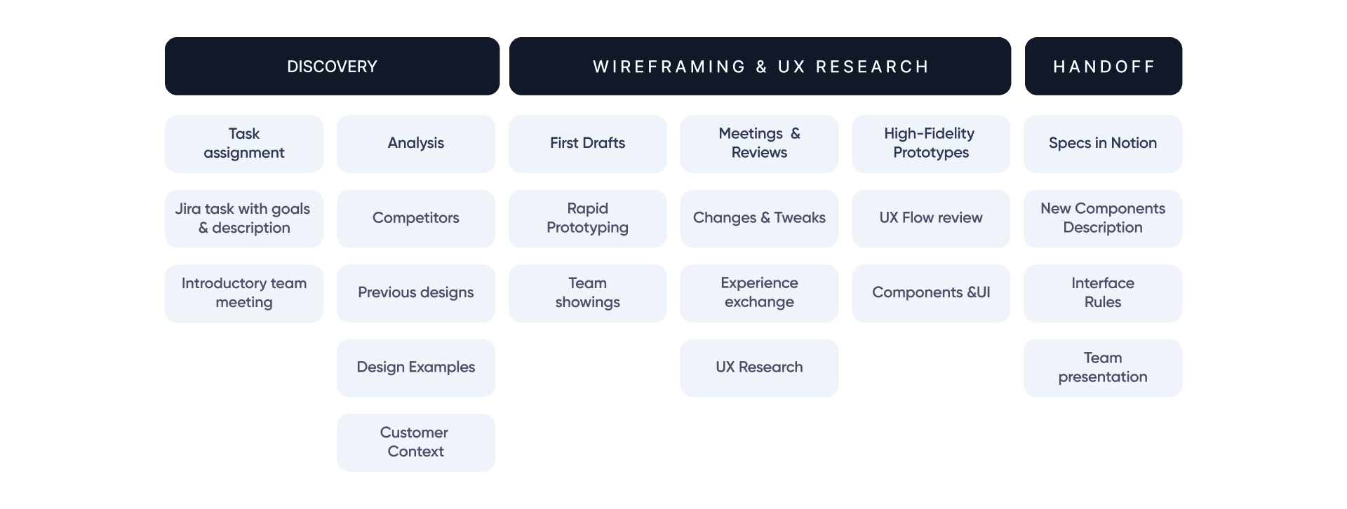
Gather information
I started by gathering and comparing the product card designs of our competitors.
Our main competitors were Yandex Eats, Delivery Club, and Sber Market. I also arranged meetings with other designers from my team to learn more
about the previous card design and decisions made.
Prototypes in Figma
After creating card design, I prepared animated prototypes that imitated how the real app works. For that, I used Figma components.
UX Research
To test our new designs, I collaborated closely with the UX research department, which resulted in picking the best design decision by carefully testing our current users. We used deep interviews and qualitative research to prove or refute the hypotheses I highlighted.
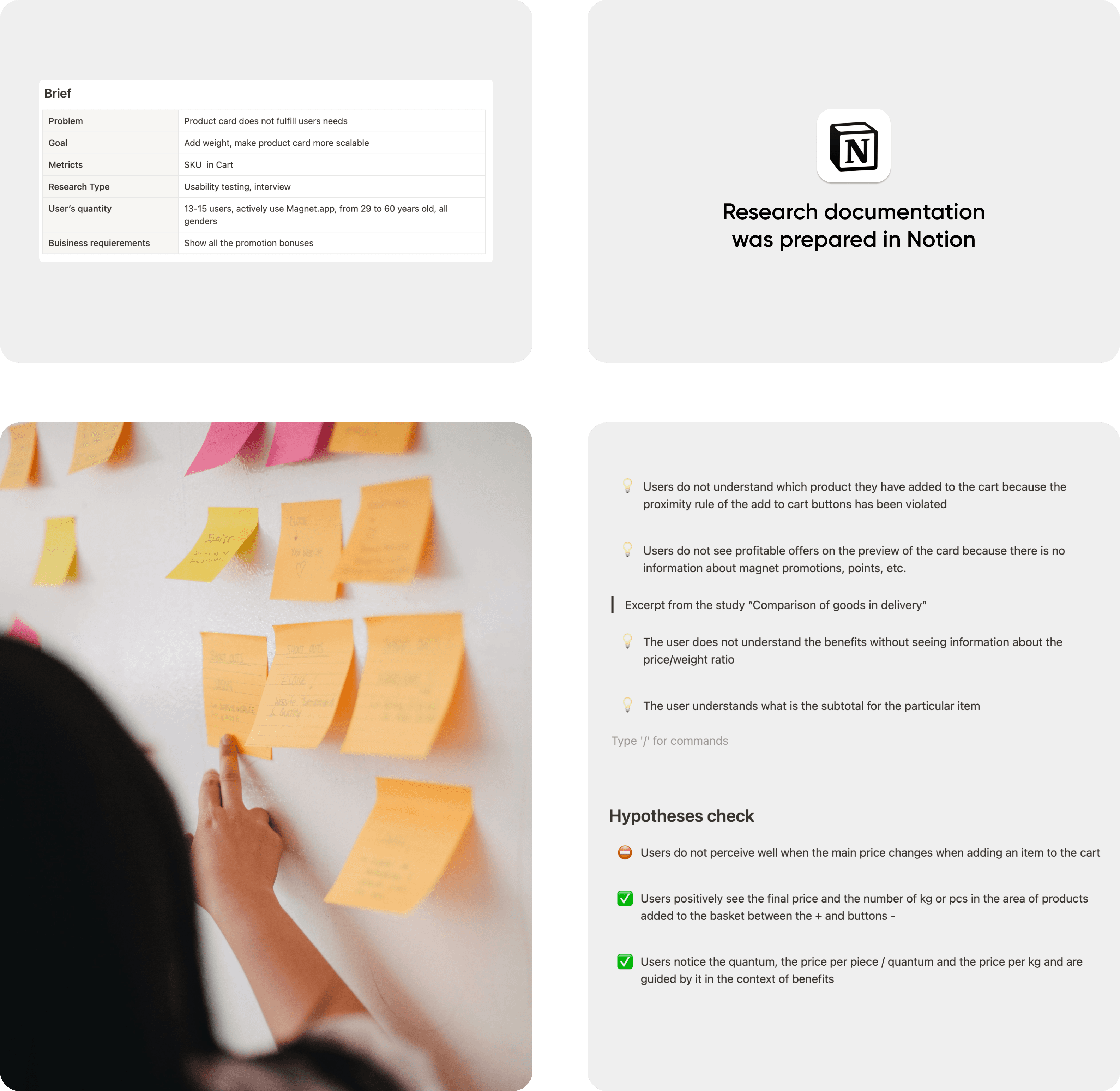
Rethinking the design created
After the UX research was done, it was time to finalize the designs, make tweaks based on the insights we gathered during our research and create documentation for developers based on Figma and Notion files. Also, a presentation was held to show improvements that were made to the product development department.
Design process
Gather
information
I started by gathering and comparing product card designs of our competitors. Our main competitors were Yandex Eats, Delivery Club, Sber Market. I also had meeting with other designers from my team to know more about the previous card design.
Protoypes
in Figma
After creating card design, I prepared animated prototypes that imitated how the real app work. For that, I used Figma components.
UX Research
To test our new designs, I worked closely with UX research department, which resulted in picking the best design decision by carefully testing our current users. We used deep interviews and qualitative research to prove or refute hypotheses I highlighted.
Insights and rethinking the design created
After the UX research was done, it was time to finalize the designs, make improvements based on the insights we gathered during our research and create documentation for developers based on Figma and Notion files. Also, a presentation was held to show improvements that were made to the product development department.
New feature tested
and ready for implementation
Now, in the Delivery (2.0) application, the price per quantum is displayed in the weight product cards (i.e., the amount of goods that can be added to the cart). We want to show the user an additional cost per kg, so that the user can compare prices and choose more favorable offers for himself. You need to draw layouts for displaying the price per kg for weight products in the catalog and product cards.
New feature tested
and ready for implementation
Now, in the Delivery (2.0) application, the price per quantum is displayed in the weight product cards (i.e., the amount of goods that can be added to the cart). We want to show the user an additional cost per kg so that the user can compare prices and choose more favorable offers for himself. The designs and specs are ready for a hand-off to a development team.
Gather
information
I started by gathering and comparing product card designs of our competitors. Our main competitors were Yandex Eats, Delivery Club, Sber Market. I also had meeting with other designers from my team to know more about the previous card design.
Protoypes
in Figma
After creating card design, I prepared animated prototypes that imitated how the real app work. For that, I used Figma components.
Step 3
UX Research
To test our new designs, I worked closely with UX research department, which resulted in picking the best design decision by carefully testing our current users. We used deep interviews and qualitative research to prove or refute hypotheses I highlighted.
Insights and rethinking the design created
After the UX research was done, it was time to finalize the designs, make improvements based on the insights we gathered during our research and create documentation for developers based on Figma and Notion files. Also, a presentation was held to show improvements that were made to the product development department.
New feature tested
and ready for implementation
Now, in the Delivery (2.0) application, the price per quantum is displayed in the weight product cards (i.e., the amount of goods that can be added to the cart). We want to show the user an additional cost per kg, so that the user can compare prices and choose more favorable offers for himself. You need to draw layouts for displaying the price per kg for weight products in the catalog and product cards.